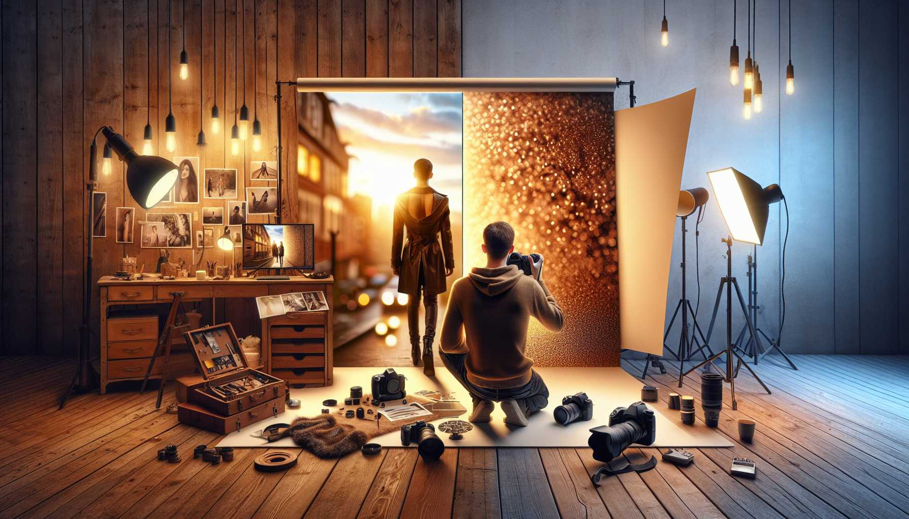
Capturing an outstanding portrait goes beyond just focusing on facial expressions. Background design plays a significant role in effectively conveying the narrative of your subject.
An expertly designed backdrop can either enrich your portrait or distract viewer attention.
Let’s delve into how to craft backgrounds which beautifully enhance your portrait images.
The Role of Background Design in Portrait Photography
Backgrounds set the overall ambiance of your portrait, providing context and emotional nuances.
Consider your backdrop as the stage on which your main model performs. An erratic or ill-suited background can divert attention from your subject.
Professional photographers understand the importance of background design and dedicate as much time to planning their backdrop as they do to instructing their subjects.
Precisely chosen backgrounds can narrate a story, subtly revealing personality traits, professional inclinations, or passions without needing any descriptions.
Choosing Appropriate Colors for Your Background
Maintaining color harmony is crucial when designing portrait backgrounds. Evaluate your subject’s skin tone and clothing before deciding on the backdrop color.
Warm colors beautifully complement golden skin complexion, while lighter blues and grays perfect pair with cooler skin tones.
Neutral shades such as beige, gray, and soft whites are safe choices as they hardly clash with any outfit or subject theme.
Avoid using backgrounds that exactly match your subject’s clothing – this results in a merging effect, removing visual interest.
Consider the emotional connotations of colors as well, pastels induce a gentle and romantic vibe, while bold colors elicit energy and dynamism.
Making a Choice Between Natural and Indoor Backgrounds
Natural backgrounds add authenticity and offer a real-world context, making them ideal for lifestyle and outdoor portraits.
Ensure evenly distributed lighting when shooting outdoors and avoid overly populated backgrounds that can distract.
On the other hand, studio backgrounds offer total control over every aspect of the scene, including lighting, color, and texture.
Use cost-effective and flexible seamless paper backgrounds that are available in numerous colors to create clean, professional-looking portraits.
Fabric backgrounds add structure and visual weight to your pictures, with muslin and canvas materials providing subtly attractive patterns without overwhelming your subject.
Effective Use of Props and Textures
Choose props that align with your portrait’s narrative and reveal your subject’s personality, rather than overshadowing it.
Books resonate well with scholarly or intellectual themes, while musical instruments perfectly suit artists and performers.
Backgrounds with texture add visual depth, with brick walls, weathered wood, and stone surfaces providing engaging contrasts.
Avoid a clutter of props and maintain simplicity. Too many elements can create a messy tableau and muddle up your message.
Keep a check on the scale of your props as large items can dwarf smaller subjects, especially children.
Ways to Enhance Backgrounds Using Light
Appropriate lighting can aid in distinguishing your subject from the backdrop, adding depth to your portraits.
Use a hair light or rim light to create a boundary – place this light slightly off one side behind your subject.
Background lights can accentuate drama, with colored gels adding mood and atmosphere in the studio.
Avoid leveling every element with light and aim for some shadow to add depth and visual appeal.
Natural window light often lends a beautiful illumination to your background. Position your subject to make the best use of it.
Common Errors in Background Design to Steer Clear Of
Ensure you do not have unwanted elements like trees or poles in your backdrop that can distract. Always scrutinize your background edges prior to shooting.
Avoid chaotic backgrounds that vie with your subject for attention. Simplicity is generally more effective than complexity.
Ignoring the backdrop entirely is an error frequently made by beginners. Ensure every element in your frame is purposeful.
Unsuitable aspect ratios for your background design can lead to awkward cropping. Plan your composition meticulously.
Mismatched lighting between the subject and backdrop creates an unnatural visual. Aim for a consistent color temperature throughout your image.
Incorporating Depth and 3D Perception
Using a shallow depth of field beautifully separates subjects from their backgrounds. Prefer wide apertures like f/1.4 to f/2.8.
Increase blurred effect by increasing the physical distance between subject and background, either by moving your subjects forward or taking a step back yourself.
Layering elements lead to more visual depth in compositions with foreground, middle ground, and background each playing critical roles.
Incorporate leading lines to guide viewer attention to your main subject naturally. Utilize architectural or natural lines skillfully.
Different lens focal lengths affect how much backdrop details are brought to the fore. Longer lenses compress backgrounds whilst wide-angle ones expand them.
Economical Solutions for Backgrounds
DIY backgrounds need not look unprofessional – simple, inexpensive materials can help create professional-grade results.
Use large sheets of colored paper as seamless backdrops. Adhere these to walls or use stands to prop them up.
Fabric from craft stores provides endless options for adding texture. Opt for materials that photograph well under the lighting setup you have.
Outdoor locations offer a cost-free, unlimited range for variety. Scout your city for captivating walls, doors, and landscapes.
Use natural window light and a basic backdrop to create aesthetically pleasing portrait lighting. You don’t need pricey studio equipment.
Season-inspired Backgrounds
Spring-themed backgrounds can feature fresh greens and blooming flowers. Cherry blossoms and tulips create soft, romantic scenes.
Summer provides abundant foliage and the golden hour (the hour just after sunrise or before sunset) photography opportunities. Beach residential settings suit the season well.
Autumn offers deep, vibrant colors and interesting textures. Themes employing fallen leaves or harvested crops add a seasonal charm.
Winter backdrops can be minimalist yet impactful. Snow creates natural fill lighting along with striking contrasts.
Seasonal indoor decorations give you another option for variety throughout the year. Transform your indoor studio space to reflect current seasons.
Making Your Portraits Stand Out
Unique backdrops can help your work distinguish from the rest. Scout for locations in your city that others might ignore.
Maintaining consistency in your backdrop choices helps develop your signature style. Clients will instantly associate your work with your unique visual aesthetic.
Analyze portraits you admire, especially their backdrop design. Determine what elements make them effective or otherwise.
Regularly practice various background design techniques. Experimentation leads to creative leaps.
Remember that while trends come and go, the principles of good design remain. Prioritize timeless attractiveness over transient trends.
Finally, remember that although your backdrop should never upstage your subject, it also shouldn’t fade into oblivion. Achieve the perfect balance through experimentation and practice.
The best portrait backdrop design feels well-planned yet effortless. It should add to your subject’s narrative and showcase your artistic sensibilities.